Logistic Regression using Python & R
In this blog we will learn to build a single variable Logistic Regression using Python and interpret the model summary output.
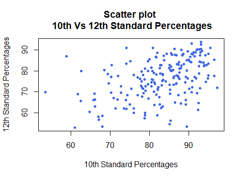
Scatter Plot in R
Analysis of Two Continuous Variables In the earlier blogs, we have learned about the Analysis of Single Continuous and Single Categorical variable. In this blog, we will analyze Two Continuous Variables. The table below summarizes the most commonly used Descriptive...
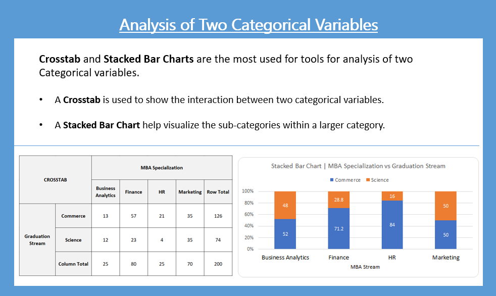
Crosstab and Stacked Bar Chart in Python
Crosstab and Stacked Bar Chart are used to analyze two categorical variables and present the interrelation between the two variables in a structured way.
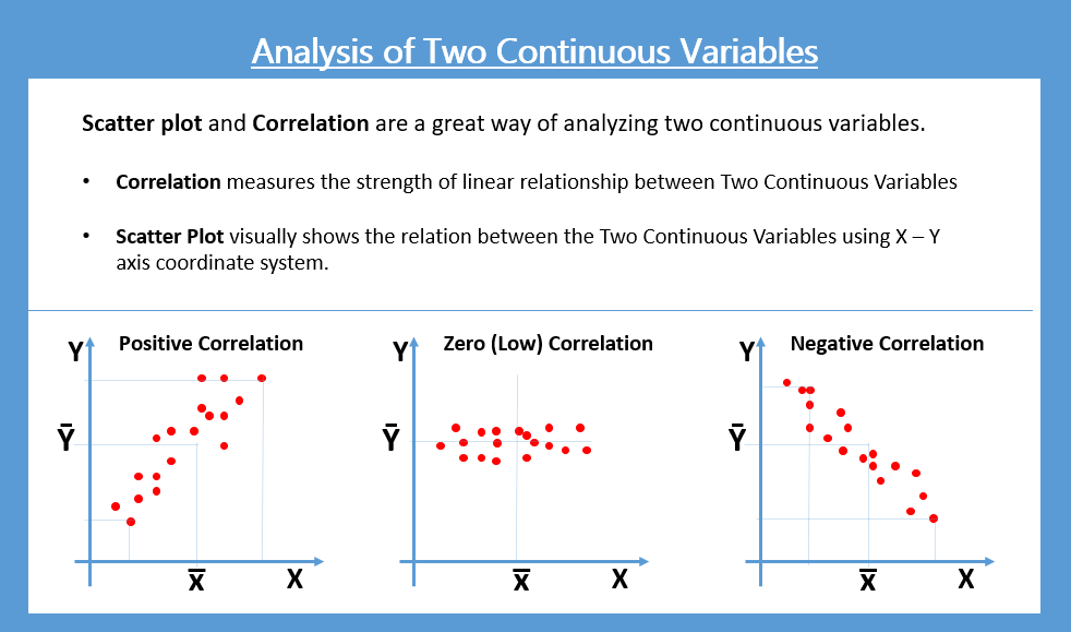
Scatter Plot in Python
Scatter Plot is used to see the relationship between two continuous variables. Correlation help us quantify the strength of the linear relationship between the two continuous variables
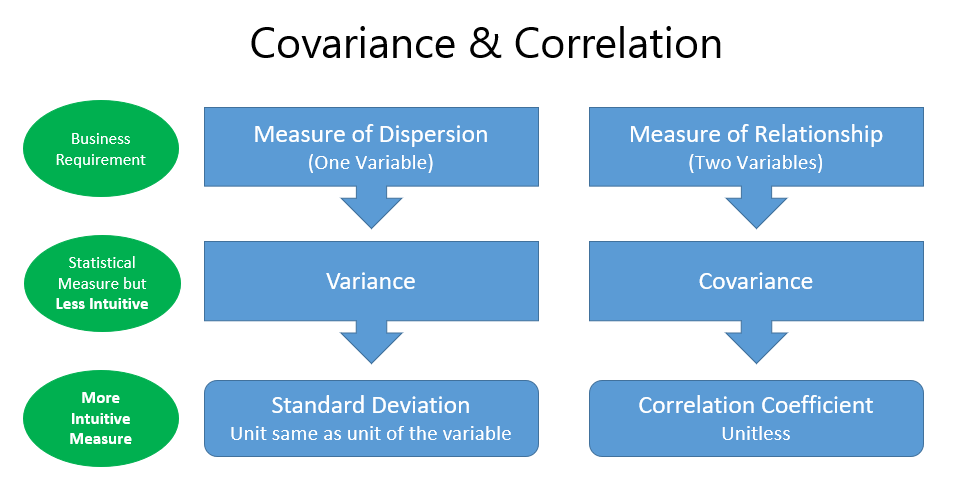
Measures of Relationships | Covariance and Correlation
The statistical measures which show a relationship between two or more variables are called Measures of Relationship. Correlation and Regression are the commonly used measures of relationship.
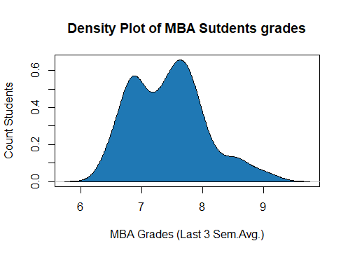
Histograms and Density Plots in R
In this blog, we will explain the Analysis of a Single Continous Variable using, Numerical, Graphical and Tabular Methods along with R Code.
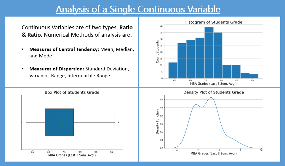
Histograms and Density Plots in Python
Histograms, Density Plots, & Box Plots are the charts often typically to analyze a Single Continuous Variable. The plots help quickly see skewness & outliers in data.
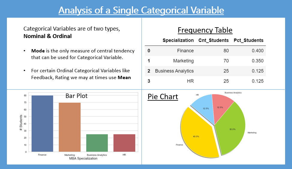
Analysis of a Single Categorical Variable
A table (Frequency table) or a graph (Bar plot and Pie Chart) displaying the occurrence frequency of various outcomes is called Frequency Distribution.
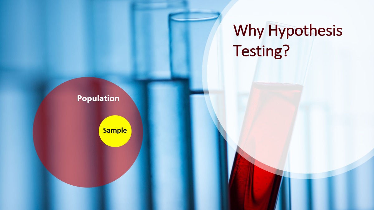
Importance of Hypothesis Testing in Model Development
Hypothesis is your opinion or an educated guess about the topic. It may be or may not be true. The statistical process of verifying it is Hypothesis Testing

